#askthestylist : creating colour harmony
Introducing our new #askthestylist series, where our interiors expert Sam van Kan is on hand to help with your home styling dilemmas. This week, we’re talking bedroom styling and how to achieve colour harmony with your bed linen and accessories.
Q
@keeniediy asked :
I have dip dyed navy and white curtains and I like to use white duvet and linen but wondering other accent colours I can introduce besides from the standard blue?
A
Our AW17 colour palette is inspired by the rich colours of Bolivia's landscape. The tones are emotive and moody, the design is dynamic, and the textures are generous and exaggerated.
The land itself seems drenched in colour, inspiring rich, saturated hues like Russet, Paprika and Berry. Visuals of the chalky, crumbled earth and burnt soil translate into earthy tones of Clay, Scoria and Nutmeg. Salty, crystalline colour combinations serve as highlights, and contrast against the deeper, richer tones. Soft mineral hues of Quartz and Amethyst, and subtle dusty Mushroom and Almond add softness to the palette. Forest, Sage and Emerald are included in reference to the lusher landscapes of Bolivia, and to reflect the latest emerging interior style.
My go-to when starting to think about accent colours is the colour wheel, which is divided into two sides: one half warm colours and the other half cool colours.
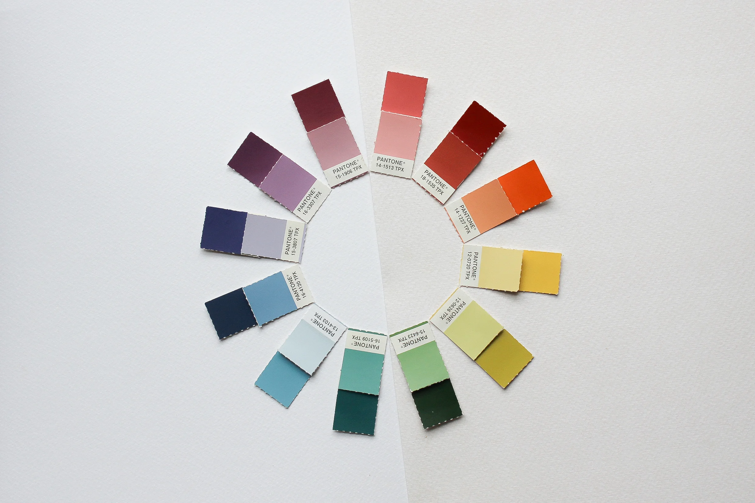
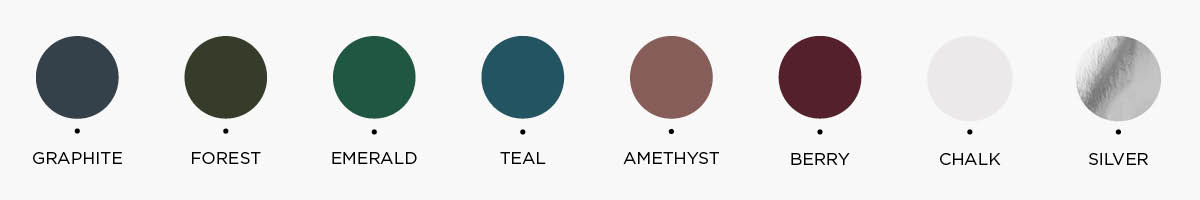
Cool tones are the blues and greens; deep Graphite, saturated Forest, Emerald and Teal, Amethyst and Berry, Chalk and Silver. These tones are calm and quiet. Drawing from this side of the colour wheel sets a tone in a room that is restful and relaxed, creating a sense of serenity.
Warm tones are the rich Russet and Paprika, Quartz and Bronze. This side of the colour wheel gives us the spicier, livelier colours. Pulling from a palette of warm colours and tones can create a more intimate feeling in a room.

A general rule of thumb when choosing accent colours is to look at the opposite side of your colour on the colour wheel for contrasting complementary colours, and the colours on either side of your colour for tonal options.
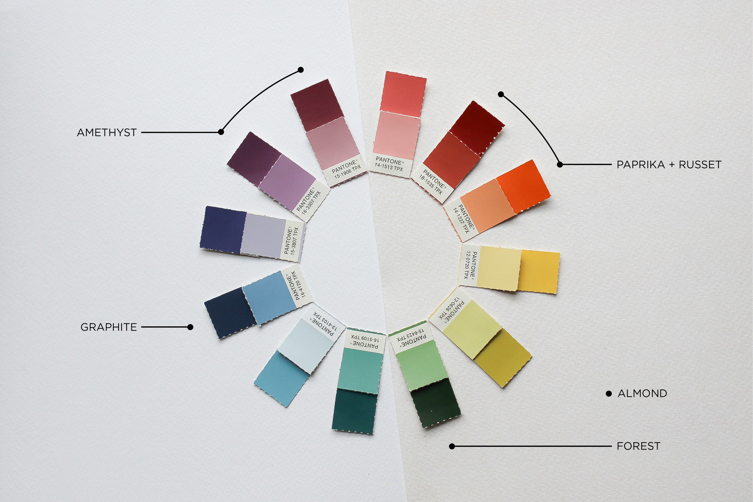
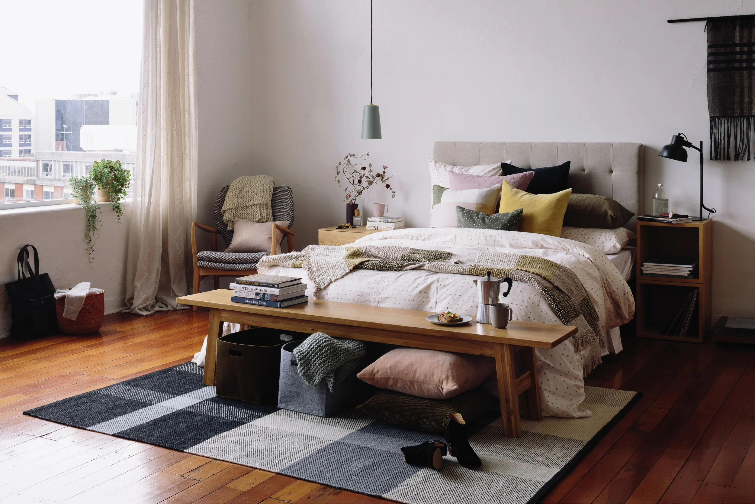
As navy sits in the centre of the cool hues, I have pulled Forest and Amethyst from either side as our tonal colours; Paprika and Russet as our contrast; and Almond and Oatmeal as our grounding neutrals. Together these colours work in harmony, but pull them apart and you can have two very different looks: a soft and calm look, or a strong and bold one.

Tonal
soft and calm
.
The key to a tonal look is in the variance of depth. If all tones are on a similar level, the look will fall flat. Adding in a few neutral colours and a plethora of texture keeps this look exciting with plenty of visual interest.
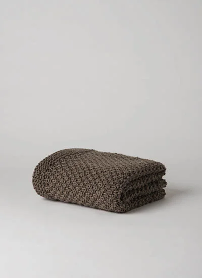
Moss Stitch Wool Throw
Scoria | $229

Suave Fringed Cushion
Scoria | $79.90

Cotton Velvet Cushion
Amethyst Tint | $49.90

Cotton Velvet Cushion
Forest | $44.90

Marl Knitted Wool Blend Cushion Date | $69.90

Chambray Linen Quilted Blanket
Navy | $299
The soft knit of the marl wool cushion and the chunky knit of the moss stitch throw are warm, cosy layers to add to the bed in winter. Our plush velvet cushion in Amethyst contrasted with the rawness of the fringed cushion and chambray linen creates creates a luxurious look with tone on tone simplicity.
Contrast
strong and bold
.
When using a contrasting colour, use it sparingly to let it be the star against the more simple tonal hues.

Chambray Linen Pillowcase
Oatmeal | $79.90

Rombo Printed Cushion
Multi | $69.90

Cotton Velvet Cushion
Amethyst | $49.90

Cotton Velvet Cushion
Russet | $49.90

Sove Linen Pillowcase
Nutmeg | $69.90

Chambray Linen Quilted Blanket
Oatmeal | $299
Using a hero cushion like the Rombo printed cushion cover can help bring a look together. By pulling colours from this cushion to create the basis of your look you are guaranteed that it will be cohesive. A throw at the end of the bed grounds the scene and breaks up the solid area of the duvet. The chambray linen bedspread in Oatmeal will add warmth to a white duvet helping the strength of the Russet velvet cushion feel right at home.
In winter when it’s cold and grey outside, having warm colours in your bedroom will help it feel cosy and inviting. In summer colours feel more saturated and bold, so inject a few cooler tones to balance out the warmth.
When it comes to choosing accent colours, balance is the key! Choose palettes that blend just a pop of the warm in with a cool colour scheme, or vice versa, to create balance in your room.
Have fun with colour @keeniediy I can’t wait to see which way you take it – tonal or contrasting!
Sam x
Don’t forget to enter your updated bedroom in our #cittahomestyle competition over on Instagram to be in to win a $1500 Città gift card. Just make sure you’re following @citta and @homestylemag, gram your sleep space and #cittahomestyle.
Want to submit your styling dilemmas? Keep an eye out for our #askthestylist posts on Facebook and Instagram and comment with your questions.